Summer Round-Up
Willard Boepple at Salander O’Reilly; Cityscapes at George Billis; Joan Brown at George Adams; Plus post-industrial folk art and two-headed prima donnas.
by Maureen Mullarkey
Willard Boepple is a sculptor whose vocabulary draws from the look and language of architecture.
 |
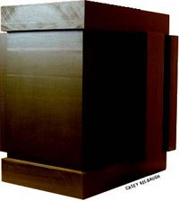
| Willard Boepple Temple, 2003 |
Architecture is a social art, a reflective instrument of the society for which it builds. Any sculpture that aggressively refers to it, leaning on the prestige of the architect’s craft, makes itself vulnerable to distinctions between the communal aims of architecture and the more individualistic ones of fine art. It risks the charge of mimicry, which is what remains once structural complexity, weight-bearing concerns and purposes of shelter and assembly are removed.“Room” (2000) is a nine foot high skeletal house-shape in patinated aluminum. Light on its feet and open like a trellis, each of its four sides resembles the leading of Frank Lloyd Wright’s characteristic stained glass windows. Here are the same closely paired verticals on each side of a broader rectangle, joined at intervals by short parallel bars. Where quadrangles of colored glass might be, Mr. Boepple drops aluminum panels perpendicular to their posts to serve as shelving.
Viewers are likely to wonder where on the lawn this shining gazebo would show to best effect. Seen straight, unfiltered through the lens of stylish discourse, it is unmistakably an upmarket garden folly. Picture it covered with wisteria vines, shelves stocked with dahlias and wild strawberries in Italian pots. Yes, I know the thought is inadmissible “in the ateliers of any pedantic fine art,” to use Wright’s phrase; and it is hardly what Mr. Boepple intended. But what an artist intends and what he achieves are not identical. It is a fallacy to confuse them.Mr. Boepple’s three dense, painted poplar “temples”, each from 2003, suggest compressed tabletop rearrangements of David Smith’s rectangular forms for “Cubi IX” (1961). Anyone interested in modern sculpture will be reminded also of the cubical variations of Jacques Schnier and Hans Aeschenbacher from the same period.
Designated as temples, Mr. Boepple’s block configurations assert kinship with the ancient megaron, precursor to Doric structures. (The megaron informs Wright’s Unity Church, which he referred to as a temple.) But Mr. Boepple’s suppressed entrances do not lead to any interior sanctum; they go clear through to the other side. Sacred space is displaced by a box puzzle, a simplified maze that exposes its own blind alley. If you rest a drink on top, no deities will be offended.


511 Gallery (formerly Miller/Geisler) celebrates its name change with a group show of 13 of its artists. The exhibition is ambitious, aspiring to stretch common understanding of what constitutes painting and sculpture. It promises art that moves beyond crusty constraints to become more elastic in definition.
Lurking here is the assumption that tradition is an antique, like the stiffened antimacassar on the back of great-grandpa’s chair. It is an attitude aimed at audiences who comprehend tradition as a reiteration of the past rather than an inheritance to be interpreted by each generation for its own purposes.
511 showcases the fruits of that mistake. Post-industrial folk art is the reigning genre. Unlike the pre-industrial kind, made by untrained individuals, the post variant is a mass product forged in an art school vernacular. Outsider art is now insider art, a reversal enabled by pundits, promoters and academics for whom artwork exists as a mere incident en route to the commentary.
Jennifer Odem dyes a cheap crocheted table cloth red, soaks it in acrylic medium, then flops it on the floor to set. Ed Fraga takes the votive path with “Cathedral” ( 2001), a crude plywood construction that cobbles a headless Christmas ornament with a tiny landscape cut to the shape of a palladium window. Epoxy is his crucial medium. Matt Ernst’s series of small “Guideboats” (2002) gives a good imitation of the sort of thing children carry home from camp. Mark Cooper’s “Endless Column” (2002) is a roadside totem, cousin to ones that appear along the East River Drive under the overpass to the Triborough Bridge.
 |
| Bryan Le Boeuf, Trois Bateaux |
The most persuasive works are by those artists who are not straining for a style. Bryan Le Boeuf’s “Trois Bateaux” (2004), the centerpiece of his recent solo show, gives evidence of maturing to certain artistic convictions, something quite different from style. He combines sympathy for the human figure with a quirky, mildly surreal compositional wit. Watch to see where he takes it.
Sculptor Mark Mennin is similarly satisfying, mindful of the traditions of his craft. His single, small marble “Head” (2003) is a finely worked mask of a fleshy, homely male elevated by materials to a solemnity the model might lack in life. It projects from the wall at a slight angle, reminiscent of medieval gargoyles or a portrait head from the sedilia in Westminster Abbey.


Popular appreciation of landscape hinges on the romance of a good view. By contrast, the scenery of urban infrastructures—the natural setting of urban artists—is more challenging.
Even middling painters can produce attractive pictures of beautiful places. It takes more robust sensibilities to seek order and grace in city sights readily ignored. Easy pleasure is not available. Viewers are on their own to discover the emotional keynote to scenes that have nothing picturesque about them.
“Industrial Beauty” exhibits cityscape paintings and drawings by 24 artists. So much intelligent work is here that there is not enough column space to give it its due. Let me start with Stephen Hicks who impresses with the beauty of his paint handling and the vigor of his perceptions. He brings emotional depth to ordinary street corners and mobile homes. Pitch-perfect color and careful drawing, disguised by the fluidity of his paint, elevate these small paintings above the random realities they depict.
Elizabeth O’Reilly draws magic out of the 3rd Street Bridge and derelict buildings on the Gowanus Canal. True as her paintings are to their locations in and around Red Hook, they serve as microcosms of the effects of modernity on the outer boroughs of every city. She shares with Mr. Hicks a lively brush and an optimism toward her subjects. Nicholas Evans-Cato’s wide-angled “Panorama” (2003) captures the atmospheric damp of rain-washed streets. Shadowless gray light, cool tonalities, gleaming puddles and sweep of space evoke Gustave Caillabotte’s Paris on a rainy day.
 |
| Nicholas Evans-Cato, Panorama |
Ron Milewicz’ “Court House Square” (2003) is a coloristic tour de force, subordinating naturalism to the geometric structures of his motif and a high-keyed palette. The Citicorp building in Long Island City looks glorious in yellow. Geometry is also the hallmark of Rick Dula’s imposing cement factory, mathematical clarity of form taking precedence over subjective sensations.
Andrew Lenaghan negotiates the complexity and visual clutter of urban scenes with an ease of concentration that reminds me of Antonio Lopez-García’s great views of Madrid. So much is depicted, you barely notice how much is merely indicated or left out. Sudden touches of subtle color move the eye around the canvas; smooth surfaces belie the actual density of his paint.
Lois Dodd’s characteristic insouciance lends a hint of whimsy to factories in Jersey City. Richard Orient’s Long Island fish hatchery is touched with the same melancholy that informs rural barns. Thomas Connelly reveals the controlled order of a loading dock; his nightscape of a commercial lot is a harmony of brooding tones.
Diana Horowitz’ courtesy toward the man-made landscape is a constant pleasure. So is the work is Roland Kulla, Stephen Magsig, Constance La Palombara, Andrew Haines, Stanley Goldstein and others here.
Apart from Ms. Dodd, the show contains few names known outside New York painting circles. If celebrity is your guide to quality, you might as well catch the next Hampton jitney. But anyone with eyes will be glad to have seen this show.


Collaboration in the arts has a long tradition; and pooling skills to extend the range of individual talent is a worthy activity. So I had hopes for this show.
I should have known better. Unlike the anonymous cooperation of the old workshop system, contemporary couplings exist to produce a two-headed prima donna. In Axel Raben’s exhibition of nine artist pairs, art work takes a rear seat to the synthetic dyads which are the true artifacts. Viewers are thrown into the faithless arms of the press release for guidance.
David Humphrey & Jennifer Coates have a game going: one suggests a subject; the other draws it. Thus, a “composite authorial self” is created. Drawings include a bare-bottomed Santa squatting to pass snowflakes; a cartoon cat biting a bunny beside a plateful of maggots. In this way “habits are disabled, inhibitions are dissolved … and skill-shortcomings encouraged.” Precisely.
Laura Lisbon & Suzanne Silver investigate “the mutual interference of layered mark-making.” They take turns scribbling on legal paper and post-it notes with colored pencil, likening their process to the Talmud (compiled over centuries by multiple commentators). To support their self-assessment, they exhibit their email correspondence, a text inclining to the grand.
Creighton Michaels, an otherwise attractive abstract painter, foregoes painting here for a conceptual gig. He inserts twig-like dowels individually into the wall, creating visual patterns similar to those in a kid’s book of mazes. Mr. Michaels’ installation is lit, sort of, by James Clark’s fluorescent bulbs in plastic bags. Bulbs are spotted with thumb prints, like a perp sheet. Team effort is deemed “an environment … a land of a thousand dances.”
Craig & Sean Miller provide handmade miniature shipping crates topped by a doll house gallery exhibiting a nano-sample of another artist’s work. These may be interpreted as “sculptures, performance pieces or a group portrait of contemporary art practice.” Unless a crate is just a crate.
The unspoken aim of all this conspicuous mutuality is to demonstrate that the artists make the grade as intellectuals. Art making is largely a platform for self-centered egos; the work of hands is a minor interest.


Joan Brown ‘s work was a fey offspring of Bay Area figuration and funk art. Making and breaking rules to suit herself, she could be exasperating but she never bored.
On view at George Adams are works from the early 70’s: cardboard sculptures (begun in her kitchen from household materials while her studio was under renovation); a metal cutout; and large-scale paintings and drawings.
The more distant the post-60’s counter culture becomes, the more the paintings recede into the era and movements that generated them. But the constructions, rarely exhibited in her lifetime (1938-90), convey in full Ms. Brown’s distinctive inventiveness and humor. The fun of their making is still there to be seen.
Assembled here for the first time as a body of work, the constructions articulate a nimble faux-naif sophistication that survives the tropes of their times. Cutout couples dance around the deck of “Luxury Liner” (1973), a Noah’s Ark for party animals. The smokestack belches a musical score. “Divers” (1974) hangs from the ceiling so we can see the swimmers from above and below the water line. “Dancers on a Car” (1973 is just that: a couple waltzing across the hood of a 1940’s-style sedan, a Florine-Stettheimer-like fantasia in 3-D.


“Willard Boepple: Sculpture” at Salander-O’Reilly Galleries, 20 East 79th Street (212.879.6606).
“brush, pencil, chisel, knife” at 511 Gallery, 511 West 25 Street (212.255.2885).
“Industrial Beauty” at George Billis Gallery, 511 West 25th Street (212.645.2621).
“Synthesis: Experiments in Collaboration” at Axel Raben Gallery, 526 West 26 Street, (212.647.9064).
“Joan Brown: Painted Constructions” at George Adams Gallery, 41 West 57 Street, 212.644.5665).
Versions of these essays were first published in “Gallery-Going,” The New York Sun on July 22 and 29, 2004.
Copyright 2004 Maureen Mullarkey


