
Winter Trio
Laurie Fendrich at Katherina Rich Perlow; Alice Federico at George Billis Gallery, Makoto Fujimura at Sara Tecchia Roma
By Maureen Mullarkey
“THANK HEAVEN FOR ART THAT HAS NOTHING TO PROVE!” Louise Bogan, former poetry editor of The New Yorker and a poet herself, understood the play-element at the heart of even the most rigorous art. Her exclamation could stand as a watchword for Laurie Fendrich’s playful, controlled abstractions.
A painter for over three decades, Ms. Fendrich received her MFA from The School of the Art Institute of Chicago in 1978, and is currently Professor of Fine Arts at Hofstra University. This is her first solo exhibition at Katherina Rich Perlow Gallery.
 |
| Laurie Fendrich, The Picture in the Hall, 2006 |
The artist admits to having inadvertently painted her way back to the Modernism of 1930s. But even if she refused to ‘fess up, Modernism’s early history is there to see. Her imagery is yoked to a kind of dancing Constructivism, its angularities set in graceful motion by the curvilinear rhythms of Art Deco.
The Metropolitan Museum’s Stuart Davis retrospective in the early 1990s was a watershed event in her painting. The austerity of previous work began to give way to puckish tensions between vaulting curves, parabolas and impossible swags in concert with zig-zagging linearity. While Davis incorporated identifiable motifs from popular culture into his work, Ms. Fendrich is more indirect. She does not set her sights on the the American scene in a definable way, but her assertive colors and near-cartoony biomorphic shapes are, as she puts it, “American–kind of obnoxious and brassy, no matter what”.
Each of the 16 paintings on view balances the levity proper to a game with the uncertainty that characterizes free play. Will the game come off? Can the player make it to the finish line? What can you do with the dozen disparate greens—some dull, others raucous—that dominate “Round and Round” (2006)? You balance and enhance them with small tiles of contrasting color in just the right tonal arrangements, that’s what. And you create a lovely nimbus around each color ration with a scumbled edge or the cutting away of a surface built with lush, optical transparencies.
The work is part playground, part calculated wager against chaos. Cultivation is at stake in this kind of pictorial game. But graphic wit, combined with sophisticated color interactions and attention to texture, rein in any tendency to arbitrariness. Ms. Fendrich scores for the side of refinement and pride of craft.
“Laurie Fendrich” at Katherina Rich Perlow Gallery (41 East 57th Street, 212-644-7171). This appeared in The New York Sun, December 14, 2006.

THERE IS NO ART WITHOUT CRAFT. False distinctions between the two began eroding in the early 20th century. Interaction between modernism and the crafts was intense in the prelude to World War II. Although the relationship began as a romance with the capacities of machine production, renewed respect for handwork exploded in the 1960s and continues.
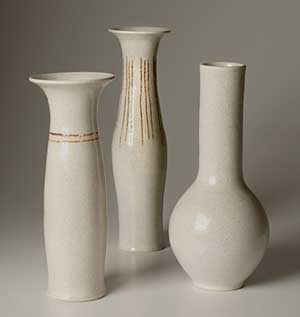
Nowhere is that regard more prevalent than in ceramics. The work of such masters as Bernard Leach—godfather of modern studio ceramics—Shoji Hamada, Michael Cardew and Dame Lucie Rie affirmed the unity of art and craft. Ceramist Alice Federico creates in the tradition of these earlier artists who understood that seriousness of purpose transcends the boundaries of what George Bernard Shaw called “easel-picture despotism.”
 |
| Alice Federico |
While she draws from a variety of sources, Ms. Federico’s deepest attachment is to the fluid, sensual forms created by the Vienese-born Lucie Rie (1902 -1990). Here are tall necks with flaming lips and rising pots that belly-out above small feet. Classically simple shapes with delicately modulated monochrome glazes, the collection is intended—as was Rie’s work—to harmonize in a domestic setting.
Form and surface are inseparable here. Subtle texturing blends with the shape to heighten, not decorate, the character of the vessel. Simple lines of sgraffito accentuate structure. Ms. Federico’s design decisions keep faith with Bauhaus emphasis on form and avoidance of surface ornament.
Modern as these pieces are, they speak powerfully of the past. One vase rises like a Ionic column, its swelling almost imperceptible. Another billows at the base in the manner of a Grand Feu design. In each object, structure is key. This is a spare, elegant collection that insists on clarity of form. Its architectonic austerity makes the old formal vocabulary (e.g. pots, potter) seem inadequate or inappropriate.
Because of the myriad ways of treating it, clay is a great imitator of surfaces. It can take on the tactile dimension and character of other materials with great conviction. Ms. Federico’s lightly pitted surfaces (created by firing techniques acting on the chemistry of glazes) are particularly evocative of weathered walls and artifacts. Several are fired with dark, metallic glazes that approach the iridescence of lusterware, an effect heightened by surface irregularities.
It is often said that good sculpture makes you want to run your hands over it. By that gauge, Ms. Federico is a highly refined contemporary sculptor. Her contours are seductive and invite caress.
“Alice Federico” at George Billis Gallery (511 West 25 Street, 212-645-2621). This appeared in The New York Sun, [hotlink]November 30, 2006.
YOU COULD NOT ASK FOR A LOVELIER INTRODUCTION to contemporary Nihonga painting than this exhibition by Boston-born Makoto Fujimura. He marries ancient Japanese techniques with the impulses of abstract expressionism. Insistent on beauty as the constituent purpose of art, he pushes a rich tradition outward toward the ineffable.
Mr. Fujimura earned his M.F.A. at Tokyo National University of Fine Arts in 1989 and studied—a first for a Westerner—in its doctorate program devoted to time-honored Japanese methods. In 1992, he became the youngest artist ever to have work acquired by Tokyo’s Museum of Contemporary Art.
 |
| Makoto Fujimura |
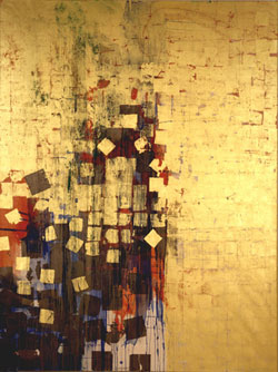
A form of water color painting dating back to medieval Japan, Nihonga is popular among contemporary Japanese artists attentive to the beauty of materials. Organic rock pigments are washed onto handmade papers. Pigments are ground from natural minerals, shells, corals, and even semi-precious stones. Applied with glue, Nihonga has properties similar to casein, one of the first binders used by man.
“Golden Fire” (2006), the exhibition centerpiece, is a splendid panorama of gold leaf that breaks to reveal traces of color both under the leaf and scumbled over it. Exceedingly thin, Japanese leaf requires multiple tiers to fully cover pigmented ground. Variation in the number of layers changes the amount of light reflected from the surface. Fastidiously applied, the contours of each successive layer create a subtle grid that alternately exposes and conceals underlying pigment. Glimmerings of color emerge from a golden mist.
The painting is flanked on side walls by sheets of black-dyed Kumohada paper (a large, strong Japanese rag paper) skimmed with gold and platinum powders. Called “Anselm’s Fire,” these sheets are a muted version of black thangas painting, a Buddhist art in which light forms billow out of translucent darks. Mr. Fujimura’s panels, more matte than their thangas models, serve mainly to absorb light, thereby emphasizing the luminosity of the gilded works.
Skip the video installation “Mercy Seat Portraits” (2006). This is conceptual boilerplate, the artist’s shrine to himself as a bi-cultural sage. Stay with the paintings. The secondary gallery is resplendent with three pieces from 2005. The calm of “Water Flame Azurite,” its successive veils of blue flecked with silver, is transporting. “Water Flame Silver” is a radiant, contemplative field of silver leaf spintered by a joyeous spray of granular whites. “Water Flame Gold” is a small song in blue and gold. All three fulfull Mr. Fujimura’s stated desire—similar to that of an icon painter—to convey a sense of transcendence by means of color and light.
“Makoto Fujimura: Golden Fire” at Sara Tecchia Roma (529 West 20th Street, 212-741-2900). This appeared in The New York Sun, December 7, 2006.
Copyright 2006, Maureen Mullarkey


