
Winter Curry II:
Diana Horowitz at Hirschl Adler Modern; Don Beal at Prince
Street Gallery; Gainsborough anyone?
By Maureen Mullarkey
DIANA HOROWITZ' ART is one of
restraint and modulation. The appeal of it lies in her retreat
from self-display in service of her motifs. Behind the work
is a dedication to technical and chromatic means that reveal
the abiding qualities of the subject itself. There are no exhibitionist
flourishes. Only quiet attention to the architecture of city
streets, industrial sites along the New York's commercial waterways,
and the kaleidoscope of Brooklyn rooftops. These are counterposed
to pastoral scenes of the Umbrian countryside.
There is a particular poignancy to this exhibition, Diana Horowitz'
first at Hirschl Adler
Modern. It opened on a night when New Yorkers were hunkered
down, avoiding the subway and looking over their shoulders to
see if the heightened terror alert would end uneventfully or
in atrocity. The subject matter could not have been more timely
in its presentation of two related worlds: one under immediate
threat; the other endangered in ways not yet visible to tourists
who still seek holiday from the race against time in which we
stand reminded that we live.
 |
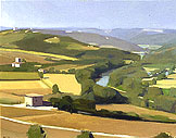 |
| Grain Silo and Still Water,
2002 |
Morning Tibor from Todi, 2001 |
Horowitz' paintings are surprisingly small for the amount of
information they convey and the terrain that individual paintings
cover. She works within the perimeters of the traditional open-air
oil sketch. Fully realized paintings maintain that intimate,
non-imposing scale and sense of immediacy that made the oil
sketch dear to artists themselves from the seventeen to the
nineteenth century. It was a tradition brought to an extraordinary
level of accomplishment by European landscape painters, Corot
among them.
These are Horowitz' antecedents. She makes gracious use of
them, balancing the improvisational appeal of plein air
against the demands of unromantic modern construction. Take
notice of Fifth Street, Gowanus Basin. In a width of
no more than 20 inches, she confronts a wedge of pier that juts
forward, splitting the canal in two. Series of individual pilings
are rendered fluently as a solid block, emphasizing the ingenuity
of the structure as a loading platform and its aggressive pragmatism.
Yellow freight-lifters, too small to be depicted in drab detail,
supply just the right color note to enliven the browns and grays
of the locale.
Light and atmosphere are the heart of the oil sketch. Horowitz
is very good at capturiing daylight, that muting haze from summer
heat or New York smog. Looking at these paintings, I was reminded
of Seurat's comment that he painted landscapes to "wash
the studio light" from his eyes. Her light is faithful
to the effects of sun filtered through atmospheric vapor. In
each of her most satisfying works, a play of grayed tones provides
a stage for the surprise of a deft touch of saturated color.
I love these Brooklyn paintings. I know the settings in real
life. What a delicious shock to be brought up short by suggestions
of undetected beauty in places we hurry to pass. Horowitz' industrial
scenes are not dry reductions to essential forms: those notorious
cylinders, spheres and blocks. Something more humane is at work
here. It as if the unacknowledged splendor of the human labor
performed on these piers were suddenly made visible. That beauty
comes only in flashes, a momentary insight in passing. Hence
the appropriateness of the oil sketch. Horowitz works with an
unprejudiced gaze that greets quotidian neighborhood sights
with as much regard as an Umbrian castle town.
The speed and abridgements of the sketch fail their subject
only in two small paintings of the Brooklyn Bridge seen from
above. Missing is any iindication of the real life majesty of
the bridge. It is rendered, out of necessity, simply as a diagrammatic
pattern across the East River. Or perhaps the impediment is
as much in me as in the paintings. Since the vantage point from
which they were done—a tower studio in the World Trade
Center—is gone forever, I want more from them than a sketch
can bear. I want some sense of the elegiac, the prophetic, a
hint of unease. But of course, that is not fair. When they were
painted it was just one more overcast day in a confident city.
Art is not made in a vacuum. Neither is it viewed in one. No
innocent eyes exist. Just as our understanding of the art of
the past is enhanced by knowledge of the context in which it
was produced, so too, our approach to contemporary art is shaped
by our understanding of the world addressed by it. In all, here
is painting that affirms its own world and earns a welcome from
it.
Hirschl Adler Modern, 21 East 70th Street,
New York 10021 Tel. 212.535.8810

DONALD BEAL'S INSTINCT FOR COLOR
is deeply appealing. And instinct it is. Color sense cannot
be forced. It has to come of itself, rather as memories do,
by natural association and unbidden, long after striving for
it has ceased.
For the majority of contemporary painters, color precedes form.
It is from color that forms are made. Painters committed to
maintaining identifiable reference, however loose, to the world
as it appears, must grant color a structural role. The finest
of Beal's work here maintains a subtle, lyrical balance between
the constructive and expressive uses of color.
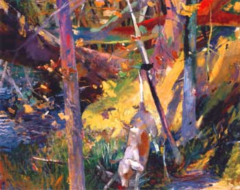 |
| Woods, Dog and Rabbit, 2002 |
On show—Beal's first at Prince Street—are a series
of large explorations of the Provincetown Beech Forest. Played
fortissimo, they are generous orchestrations of natural scenes
that use color for its lyrical properties without losing touch
with reality. Maura Coughlin's comment in the exhibition brochure
gets it just right in specifying the advantage of the subject
to Beal's coloristic approach:
The Beech Forest landscape is so much less sublime, much
less easy to generalize: it shifts with every footstep and
changes with the seasons. It was without an an obvious horizon,
focal point or delineation between fore, middle and background,
and Beal found it endlessly challenging, demanding its own
complex visual language.
The language is simply that of color, seeded—in the most
convincing works—with hard facts. It is for good reason
that Woods, Dog and Rabbit was chosen for the announcement.
Together with Dogwalker (Red Tree), this is Beal's work
at its most distinctive in terms of color and compositional
discretion. Each of these uses the strong verticals provided
by trees to stabilize the dappled disorder of sunlight and shade
on woodland underbrush. In each, a spotted dog serves as a useful
natural form for providing the needed neutralizing of high-keyed
color rhymes.
Swamp and the over-sized [102' square, hung on the diagonal]
Ladyslippers are lovely to look at. But color sensation
is not the whole of painting. For me—and I make no special
claims for personal taste—these are weakened by having
surrendered too much to abstraction. In each of them, color
spills across the surface, giving the effect of something vague
waiting to be shaped. Pretty, painterly abstractions that abandon
description have become commonplace. The differences between
them, no matter the artist, are more rhetorical than visual.
But Beal has an authentic gift for sustaining tension between
a measured abstraction and visual truth. Why muffle the accomplishment?
The monumental Family Outing is quite different in feel
and in influence. While the landscapes follow the chromatic
lead of earlier colorists, this image of a standing woman seems
more consciously contemporary. David Parks and Richard Diebenkorn
are not far in the distance. It is an impressive painting if
a bit unsettling. Color is more somber here, the rhyming gone.
Its gritty modernity lends it a frisson that the subject
itself might not suggest.
Prince Street Gallery, 530 West 25th Street,
New York NY 10001; Tues - Sat 11 - 6 PM
GAINSBOROUGH, ANYONE? The first
volume of Tate Britain's house magazine features an article
by William Vaughan, "Gainsborough's
Modernity." The title tells us much: we should look
at Gainsborough because he is more up-to-date than we think.
And, yes, that is true. But there is hazard in this approach.
The downside of it is the implication that, were it not for
his crypto-modernity, Gainsborough could be relegated to the
dustbin of history, one dead white curio among a host of others.
In its way, it is a parochial response. It places the burden
of proof on the past. History must convince us moderns of a
reason for engaging with it. We are absolved of any obligation
to enter the past with the same courtesy we would bring with
us to any other foreign country.
Exploration of Gainsborough's relevance to audiences now, rather
than audiences then, is helpful to a point. The past is not
always graspable as something alive that speaks across generations,
let alone centuries. Scholarly efforts to grant it a voice are
welcome. The danger comes in using that past to reinforce the
false metaphor of modernist—and now post-modernist—progress.
Art, like life itself, is not a tale of progress. Some humility,
please! But this is a discussion for another day. In the meantime,
look up Vaughn's article. Better still, try to get hold of a
copy of the splendid, historically informed catalogue
that accompanied the exhibition. It represents art education
at its finest.
Maureen Mullarkey � 2003


